What Are the Best Fonts for a Resume?
Get a Free Expert Review9 min read. Updated on October 13, 2025
Table of contents
Table of contents
Table of contents
Table of contents
The right font makes your resume stand out in all the right ways
The experts say it takes 6 seconds (or less) for a hiring manager to decide if your resume is a keeper – and the font size and style you choose will have a significant impact on that decision.
A font that in any way makes your resume difficult to read or appear unprofessional will quickly land it in the trash pile. You may be the most competent candidate, but you'll be eliminated from the beginning if your resume is difficult to read.
That’s why it’s essential to know how to choose the best font for your resume.
How to choose the right font for your resume
There is a never-ending supply of fonts to choose from. Some are considered “old-school,” like Times New Roman while others are designed to be easy to read on a mobile device. Those differences can make it feel like a challenge to pick the right one.
Here are some simple tips to follow when deciding the best font for your resume.
Choose easy-to-read fonts. Your font needs to be easy to read both online and in print form.
Select a font that aligns with your profession. Some fonts are better suited for professions, such as HR and law, whereas others are more suitable for creative jobs, including music, social media, and marketing.
Select a font that fits your personality and brand (while still fitting your profession). You want the font you select to feel good to you and represent your personal brand while still meeting the standards of your profession.
Choose the correct font size. Have you ever noticed that Georgia and Calibri fonts are different sizes? If you have a longer resume that spills over onto two pages, you’ll want to use a smaller font type to help you fit it onto two pages.
What is the best font for a resume?
Of course, a lot of what goes into picking the right font for your resume depends on personal preference, but you should choose from a set of the best fonts for a resume to ensure yours doesn't get passed over.
The fonts listed below all work well on a resume due to their clean, professional look and overall ease of readability. Keep in mind that you have to choose a font that is clean and easy to read both on-screen and in print.
Arial
Calibri
Cambria
Garamond
Georgia
Helvetica
Times New Roman
Trebuchet MS
Verdana
Arial font for a resume
Arial is one of those tried-and-true fonts that have stood the test of time. Interestingly enough, it was designed to have the same width as the characters in the Helvetica typeface, which is excellent if you intend to use multiple fonts on your resume.
Some people will choose to use one font for the body text and another for the headers, and Helvetica and Arial complement each other well for this purpose.
Pros of using Arial:
It's a clean and simple font to use on your resume
Arial is easy to read, even if you're using a 10-point font
It's ATS-friendly
Cons of using Arial:
It is used more than most fonts, so it lacks originality
It arguably lacks the sophistication of newer fonts
Some feel that it's a less-than-formal font style, especially if you're applying for a creative role
Calibri font for a resume
Calibri is known for its contemporary and professional appearance, making it suitable for use in a wide range of industries. It's well-spaced, clean, and easy to read. Additionally, it's read accurately by an applicant tracking system, or ATS.
Calibri is the one to choose if you can't decide which you like the most.
Pros of using Calibri:
Modern look
Professional appearance
Lighter size so you can fit more words on a page
Cons of using Calibri:
A lot of candidates are using it, so it lacks uniqueness
It can be considered unprofessional by some industries, like law and finance
Cambria font for a resume
Cambria was initially designed to be easily read on screen, making it ideal for both print and online resumes. It has good spacing and nice proportions, which means it’s easy to read, even in low-resolution situations. The way it's designed even lends itself well to being read when printed in a small size.
Pros of using Cambria:
It has an elegance that can make your resume visually appealing
As a Microsoft Word font, you will probably not lose formatting when sharing the resume file
It's suitable for a variety of jobs across multiple industries
It has different weights, so you can emphasize and express different tones in your resume
Cons of using Cambria:
It was designed in 2007 and can be seen as old-fashioned
It's a heavy serif font, which may make it challenging to keep your resume to two pages
Garamond font for a resume
When you use Garamond font for your resume, you're truly taking a trip back in time. Garamond typeface can trace its roots back to the 16th century. Of course, today's Garamond is an interpretation of those old designs. It has an elegant appearance that almost resembles pen-writing, but with an upright design.
Pros of using Garamond:
Garamond text has good spacing, making the document it's used on appear well-balanced
It's a great font to use on your resume if you intend to have a print version ready to hand to humans for off-screen reading
It's a versatile font that is widely accepted
Cons of using Garamond:
The serif-style font is less suitable for screen reading compared to print reading
Some hiring managers feel that Garamond is too artistic for formal documents like resumes
Georgia font for a resume
Georgia is an alternative to Times New Roman that offers thicker strokes, so it’s easier to read in smaller sizes. It’s also designed to be easy to read in digital form, making it a good choice for online platforms. It offers a professional and modern look with a sense of authority combined with warmth.
Pros of using Georgia:
It's a great font for easy readability, so employers can quickly scan your resume
It's easy for on-screen and print reading
It's suitable for a wide range of professions
Cons of using Georgia:
It uses old-style numerals that might not align well with your resume as a whole
It can be seen as uninspired and basic by some
Helvetica font for a resume
We already mentioned how Helvetica pairs well with Arial. It's more elegant than Arial, though, so it works well for the section headers of your resume.
In fact, where Arial is sometimes considered too generic and overused, Helvetica is often regarded as the king of fonts due to its modern and clean appearance. One of the advantages of Helvetica is that it offers a broader range of font weights than Arial, which can help your resume stand out.
Pros of using Helvetica:
Helvetica exudes professionalism
It has a clean and straightforward design and a high readability factor
It makes your resume look clean and well-structured
Cons of using Helvetica:
Some people may see Helvetica as too clean and neutral, making your resume seem sterile and without personality
It has a dense design with tight spacing, which could make it difficult to read when you use a smaller font size
Times New Roman font for a resume
When you open Microsoft Word, if the default font isn't set to Calibri, it's probably set to Times New Roman. It is one of the most popular typefaces of all time, known for its robust design.
It was originally designed for a printed publication – The Times, from Britain – that wanted to adopt something more traditional in the 18th century that would work with a printing press. Welcome to Times New Roman.
Pros of using Times New Roman:
It is a universally accepted font – a safe choice
Because Times New Roman is a classic serif design, it gives your resume a professional and traditional appearance
Since it was specifically designed for print, the letters are still legible even when you use a small font
Cons of using Times New Roman:
Using Times New Roman font for your resume is considered, by some, to be outdated and lazy
When you use a smaller font size, the letters get squished together a bit, which can make it hard to read on a screen
Trebuchet font for a resume
Medieval war device or popular font? Surprisingly enough, when the Trebuchet font was designed, it really was named after those machines that slung huge boulders in the ages of old. The man who created it, Vincent Connare, wanted to give it a name that would signal something that “launches words across the Internet.”
Trebuchet has an elegant look that helps it stand out more than the traditional Times New Roman sans-serif font. It offers a modern look with a touch of authority and creativity.
Pros of using Trebuchet:
Trebuchet is a great font for injecting personality into your resume
There's good spacing between characters, making it easy to read on- and off-screen
It's appealing without being grandiose – consider the little tail on the capital 'Q'
Cons of using Trebuchet:
It's not very commonly used and could cause formatting oopsies when sharing your resume file
There are some variations in the character widths, which may cause you to have trouble keeping your resume to two pages
Some don’t consider it suitable for fields outside of the creative sector
Verdana font for a resume
Verdana is one of the best fonts to use for a resume, because it was specifically designed to be legible at small sizes, on screen and off. In fact, it's known for having wide proportions and loose letter spacing, ensuring that text is clearly separated and making what's on the page easy to read. It offers a clean, simple style that exudes confidence.
Pros of using Verdana:
Since it was designed for low-resolution on-screen reading, it's great for online applications and resume submissions
Verdana also has distinct letter characteristics – like a little square over the 'i' and 'j' – which make it unique
It has different weights available, giving you options for design variations between section headers and body text
Cons of using Verdana:
Even though it's easy to read, some people consider Verdana a bit informal
The loose letter spacing may mean that you have a hard time keeping your resume to two pages
What is the difference between a serif and a sans-serif font?
The basic difference between serif and sans-serif fonts is decorative. Serifs are, by definition, little decorative strokes that finish off a letter. Since 'sans' means 'without,' then sans-serif fonts are missing the little decorative strokes at the end of each letter.
Serif fonts are more traditional and formal, making them great for designing your resume. The serifs – or decorative strokes – make these fonts easier to read in print and are considered less sterile than sans-serif fonts.
Serif fonts that you can use on a resume you're going to print out include Garamond and Times New Roman.
Conversely, sans-serif fonts lack any decoration at all. These fonts are considered modern and provide a straightforward appearance, which is great for on-screen reading. The biggest downside to sans-serif fonts is that they can be difficult to read if you're using a smaller font size.
Examples of sans-serif fonts you can use on a resume that will be used for online applications include Calibri, Arial, and Helvetica.
Free Resume Review
Ensure your resume aligns with what employers are actually searching for.
What fonts should you avoid on a resume?
Since the main point of your resume is to present your qualifications in a way that shows you're the right professional for the job, there are some fonts you want to stay away from.
Specifically, you should avoid using flowery, themed, cursive, or “fun” fonts, like
Comic Sans
Century Gothic
Impact
Monotype Corsiva
Freestyle Script
Futura
Segoe Script
Trajan Pro
Papyrus
Brush Script
Along with being difficult to read and not compatible with an ATS, “artistic” fonts tell employers that you don't know the rules of creating a professional resume, which could potentially lead them to think you don't take your job search seriously.
Remember, no snazzy resume font will showcase your qualifications as clearly as your job experience, talents, and past accomplishments.
Pro Tip: Although there are no specific statistics on the exact failure rate of AI-based resume scanning tools in reading overly stylized fonts, research suggests that as many as 75% of resumes are rejected due to unusual formatting. Since artificial intelligence has become a cornerstone of job search, it's critical that your resume “speaks” to these bots.
What is the best font size for a resume?
Generally, a 10- to 12-point font size is recommended. A good rule of thumb to remember: don't decide on a font size until you've chosen the specific font you'll use for your resume. This is because fonts like Calibri, Trebuchet, and Arial Narrow take up less space than Times New Roman or Verdana.
Depending on the font, you might be able to slightly reduce or increase its size to get to the two-page resume that recruiters prefer while still ensuring it's easy to read and the format is pleasing.
However, using a font size larger than 12 points in the resume body to create two pages means you may need to add more details about your past responsibilities and achievements, or include skills developed through voluntary work and hobbies.
If you're submitting your resume online, you also might need to use a 12-point font size throughout and eliminate any formatting, like underlining, italics, or bolding. Online programs may convert your information to an ASCII format or request that you use an ASCII format so that the resume displays correctly. In such cases, a 12-point font works best.
Page formatting
The margins, bullets, and spacing you pick for your page matter just as much as the font and font size. At the end of the day, you want your resume to be accurately read by an ATS and impress a hiring manager. In addition to clearly outlining your qualifications, skills, and career achievements, ensure you have a well-organized document that’s readable and professional-looking.
A lot of that comes from consistency. To ensure that your resume looks the way it should and is aesthetically pleasing, here are some formatting rules for you to follow that will guarantee consistency:
Margins: Use balanced margins that are no less than 0.5 inches all the way around. It's okay to have your top and bottom margins different from your left and right margins, but you want to avoid having a top margin that's less than your bottom margin.
Spacing: You can use the line spacing formatting feature of Microsoft Word or Google Docs to ensure that you have consistent spacing. If you're using 6pt line spacing in front of one section header, make sure you take the time to check that all section headers have 6pt spacing in front of them.
Bullets: While you have some leeway on the type of bullet you use, it's best to stick with a simple dot bullet to make sure that your resume looks the same on the hiring manager's computer as it does yours. Also, for the love of all things resumes, double-check that all of your bullets line up. Fewer things scream, “I didn't pay attention,” than bullet points that are out of alignment.
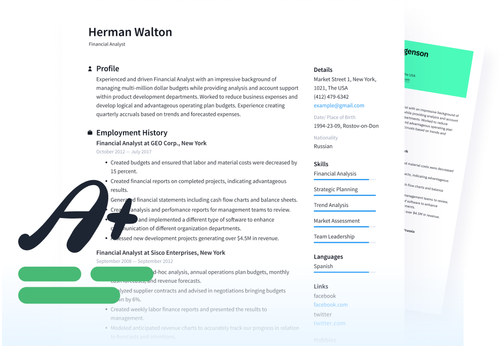
Graphics, icons, and images: Avoid using them altogether. The ATS can't properly parse information from resumes that contain elements such as charts, images, and icons. Since it turns your resume into a text file, those images get converted into funky characters.
The best font for your resume sends the right message
There are three specific targets to aim for when choosing a resume font:
Does it present you as a professional who is well-qualified for the job?
Can recruiters and hiring managers easily read and scan it for critical keywords and information?
Will it be read correctly by an Applicant Tracking System or an online application program?
A well-written resume is always the key goal, but a particular font can have a major effect on the message you convey to a potential employer, whether that's of a seasoned expert, a young and hungry professional, a new graduate, or anything in between.
It can also mean the difference between getting called for an interview and getting a “no thanks” email. Take the time to follow these tips and create a resume that clearly presents who you are, using the best font for your resume, and you'll find yourself interviewing in no time.
Does your resume use the correct fonts and formatting? Why not submit it for a free resume review to find out?
This article was originally written by Lisa Tynan and has been updated by Marsha Hebert and Ronda Suder.
See how your resume stacks up